IRCTC Rail App
A passenger-first redesign of India's most-used train booking interface. The project focused on the Passenger Details screen — the most abandoned step in the booking funnel — restructuring it to reduce form friction, clarify berth class selection, and make waitlist status legible to everyday users.
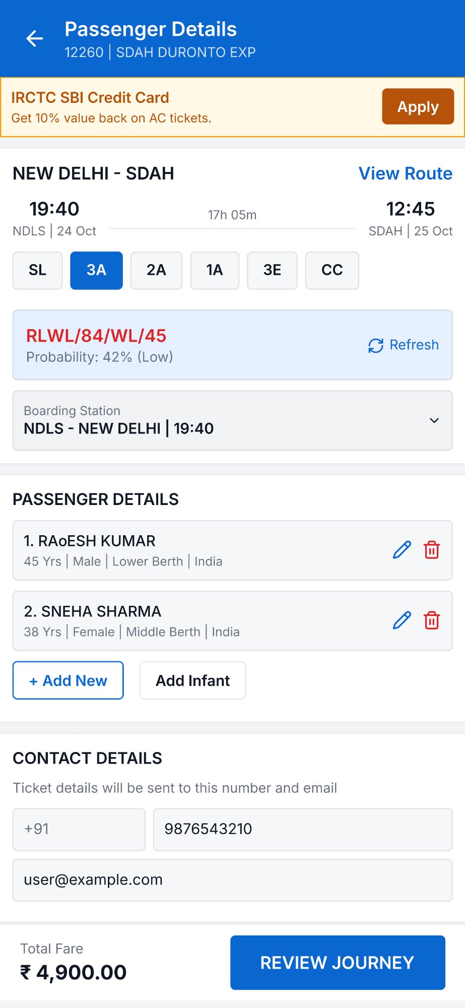
IRCTC books 800,000+ tickets daily — but the booking form is one of the most confusing in Indian consumer apps. Waitlist codes like "RLWL/84/WL/45" cause real user anxiety. The goal was to redesign without removing a single field — only reorganise and translate.
IRCTC handles over 800,000 ticket bookings daily. Despite the scale, the Passenger Details screen — the most critical step before payment — remains one of the most confusing forms in Indian consumer apps. Users frequently misread waitlist statuses, fill incorrect berth preferences, and abandon the flow when multiple passengers are added.
- Make berth class availability instantly readable
- Reduce multi-passenger form errors
- Clarify waitlist probability without jargon
- Preserve all IRCTC functionality
- Keep the interface familiar to existing users
The original design shows raw quota codes like "RLWL/84/WL/45" with no explanation. The redesign translates this into a two-part label: a human-readable status ("Waitlist") with the numeric depth, and a probability badge (Low / High / Available) using colour coding that aligns with traffic-light conventions already familiar to Indian users from apps like Zomato and Swiggy.
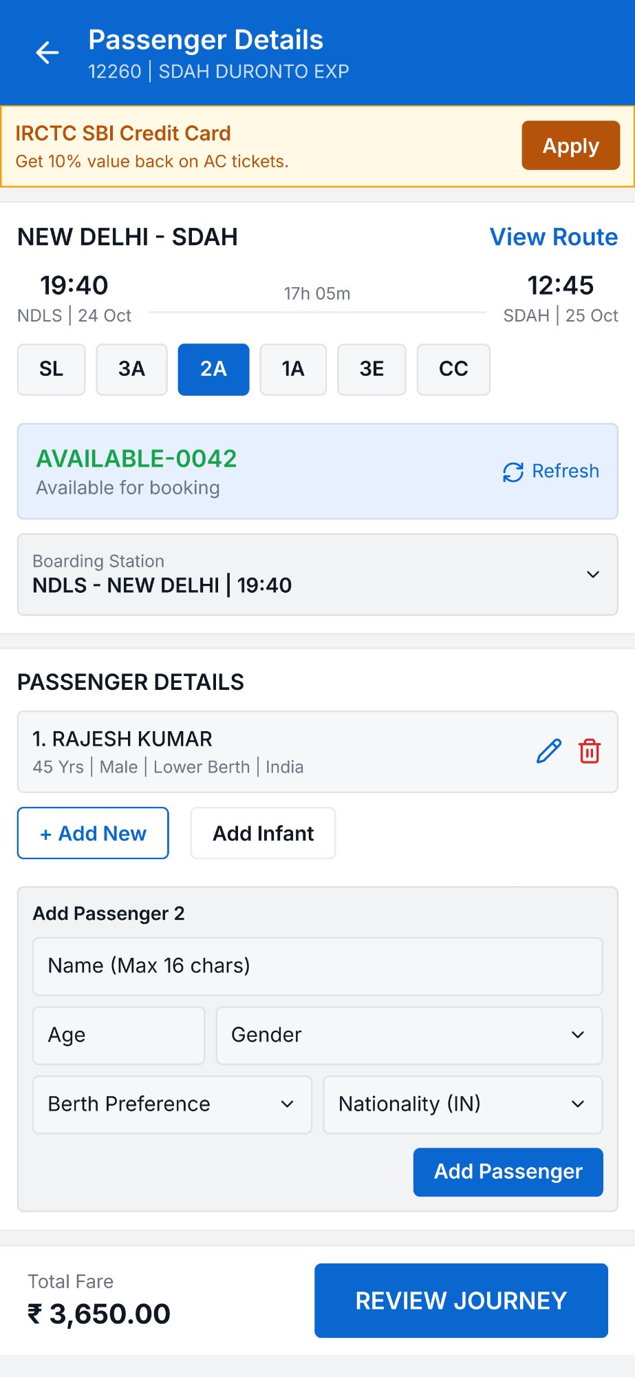
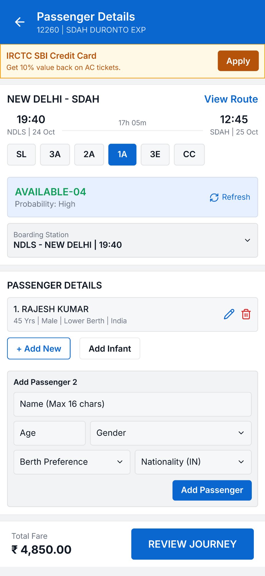
Class codes (SL, 3A, 2A, 1A, 3E, CC) are presented as a horizontally scrollable tab bar with the selected class clearly highlighted in the brand blue. Rather than a dropdown, this lets users compare classes at a glance without leaving the screen — reducing the number of taps needed to evaluate options from 4 to 1.
Adding a second passenger previously revealed a completely separate form that replaced the page context. The redesign uses an inline expansion pattern — the form appears below the existing passenger card, keeping all previously entered data visible. Each passenger entry is displayed as a compact summary card with edit and delete controls.
The total fare and "Review Journey" button are fixed to the bottom of the screen and update in real time as passengers are added or preferences change. This eliminates the need to scroll to the bottom to see the total — a common frustration in the original app where the CTA was buried after a long form.
The IRCTC Passenger Details screen is the most abandoned step in the booking flow. Users consistently get confused by raw quota codes like "RLWL/84/WL/45" and misread berth options. I wanted to answer: what if this screen felt as simple as buying a movie ticket?
A first-generation smartphone user from a tier-2 city booking 3A tickets for family travel. They use IRCTC 3–4 times a year, don't understand waitlist probability, and get nervous when the screen shows a red code. They need plain language, not railway terminology.
I translated "RLWL/84/WL/45" into "Waitlist — Low probability" with a coloured badge. Berth classes became a tab bar (SL, 3A, 2A, 1A) instead of a dropdown. The Add Passenger form expands inline under the existing passenger card — no page jump, no lost context. The total fare and Review button are pinned to the bottom.
Government app redesigns have a hard constraint: every field and option must remain, as they are policy-mandated. The design win here is not simplification — it is translation and reorganisation. Every piece of information the original screen showed is still present, just presented in a way users can actually act on.
The most interesting constraint on this project was the requirement to preserve every existing IRCTC feature — nothing could be removed, only reorganised. This is the reality of redesigning government and large-scale enterprise apps: the feature set is fixed by policy, not by UX logic.
The biggest gain came not from simplification, but from translation — converting technical quota codes into language everyday users understand, and surfacing the information people actually need (availability probability, total fare) at the moment they need it.