Notiva
An all-in-one workspace app inspired by Notion — combining a rich document editor, templates, personal pages, and team collaboration in a clean, minimal interface. Designed for students and creators who want their thinking organised in one place.
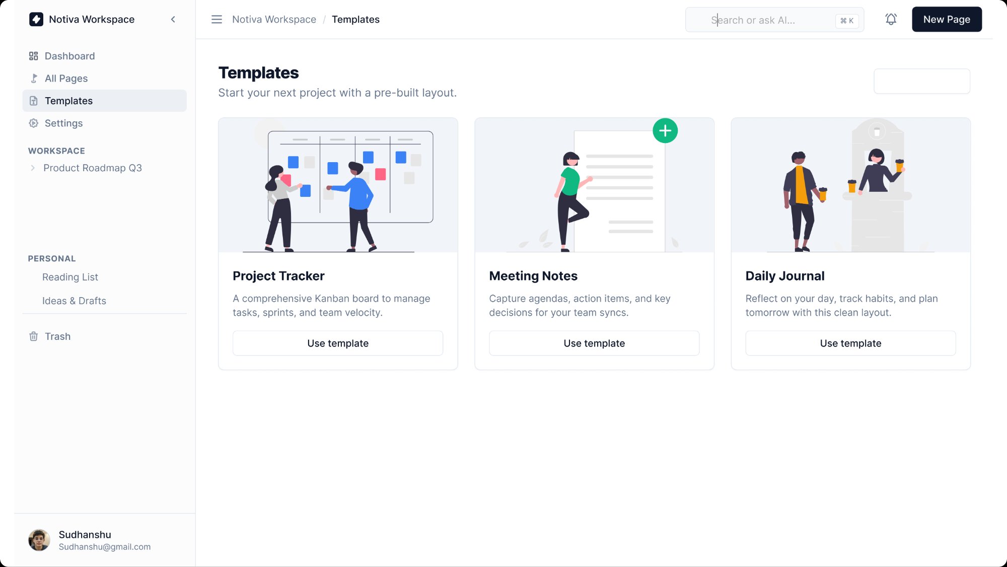
Notion is powerful but overwhelming for new users. The blank page with no guidance causes abandonment. Notiva is designed for students who want a Notion-like workspace but need guardrails — a dashboard that shows what to work on, templates that get them started in one click, and a page structure that doesn't require a tutorial.
A design or engineering student managing course notes, project planning, and reading lists. They want one tool instead of five — but they don't have 3 hours to configure a Notion workspace. They need something that works immediately and looks good.
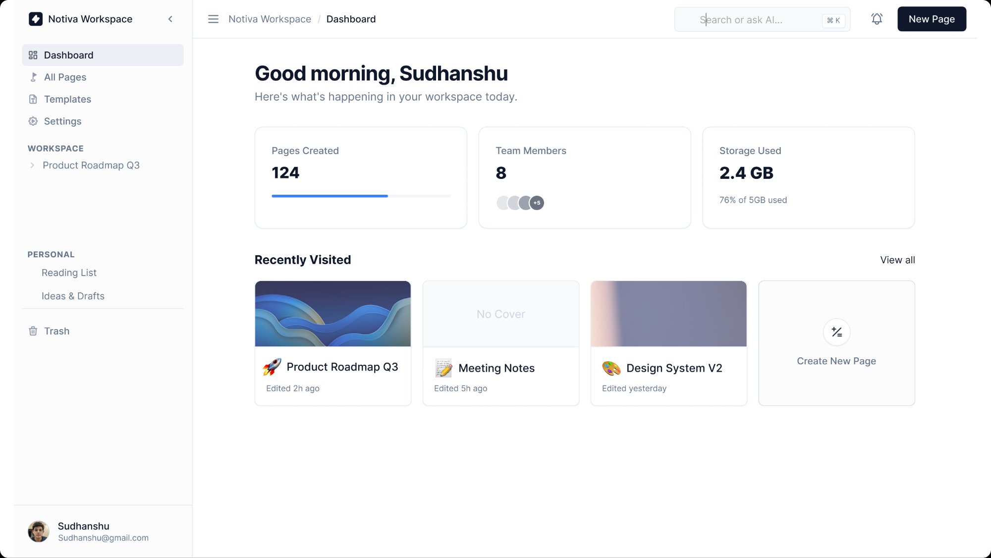
The dashboard shows Pages Created, Team Members, and Storage Used as three cards — giving an instant workspace health check. 'Recently Visited' shows the last three pages as large card thumbnails with covers and titles. The sidebar separates WORKSPACE (shared) from PERSONAL (private) to make the mental model clear from day one.
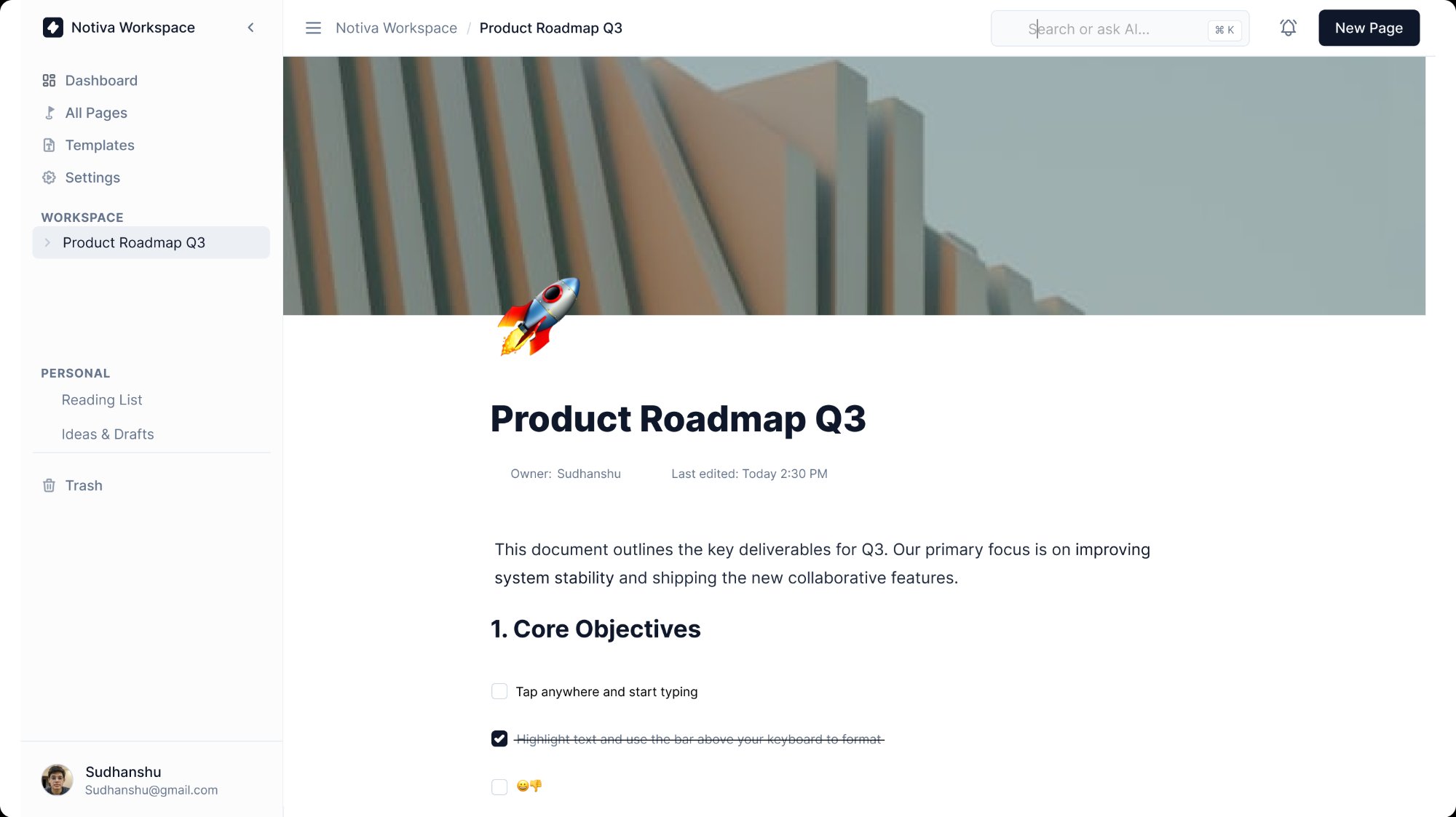
The document editor uses a full-width layout with generous top margin before the title, a cover image zone, and a drag-to-add icon. Checkboxes, headings, and body text are the only elements shown by default. The Danger Zone in Settings uses a distinct red section — a common pattern in settings UX that communicates irreversibility without needing a paragraph of warnings.